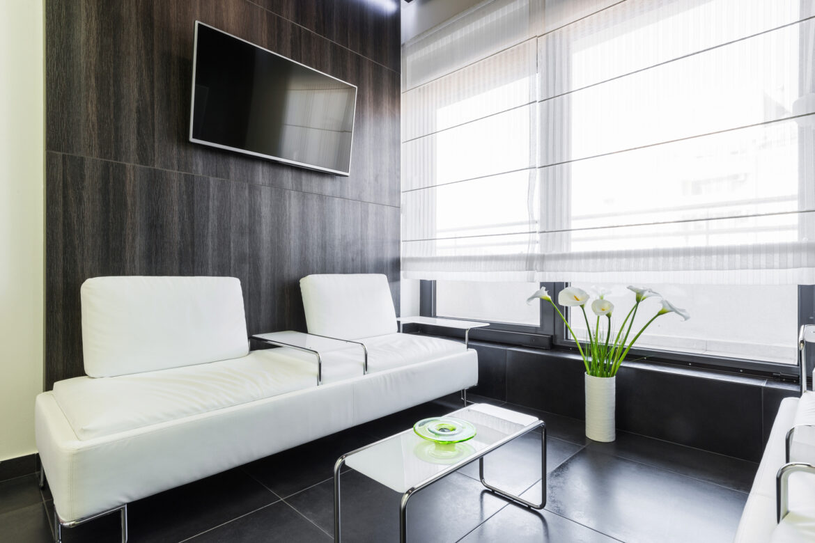
How to Design an Inviting Dentist Office Waiting Room
Did you know that people wait for an average of 32 minutes before seeing a doctor or dentist? If you want to enhance the patient experience, it starts the moment they walk through the door. So how can you make those 32 minutes enjoyable?
Keep reading for our tips on how to design a dentist office waiting room.
Implement Social Distancing Measures
As of the fall of 2021, the Centers for Disease Control and Prevention (CDC) are still advising people to observe social distancing measures to help prevent the spread of COVID-19. The general guidelines suggest people should remain at a distance of at least 6 feet. Having fewer chairs is a simple way to follow social distancing guides when thinking about waiting room design ideas.
Rather than having lines of bench-style seats, use separate chairs and sofas in a variety of postures and orientations. The seating options you do offer should be made of a material that is easy to sanitize. Add some moveable or adjustable acrylic barriers to add an additional layer of protection between unrelated patients.
Take a look at these dentist office design ideas for inspiration.
Remove the Mystery of Wait Times
Many would agree that one of the worst parts of visiting the dentist or doctor is the wait. No one likes sitting around for an indefinite amount of time. You can help ease patient anxiety by removing the mystery of wait times.
Similar to the screens used at DMVs that call out numbers to help the next person in the queue, medical office waiting rooms can leverage this tech too. Have a screen in your waiting room that shows the order of when patients will be seen and the approximate time frames. As you need to keep patient data secure, only use initials or last names on the screen.
Offer Free Wifi
Magazines or coffee table books are commonplace pieces that can be found in any old waiting room. Sure, people may flip through them, but it’s probably not their preferred choice of entertainment. Instead of subscribing the office to copies of People or US Weekly, invest in a better wifi network connection.
Make Sure It Is Accessible
Meeting the basics of ADA standards typically means that your office is able to accommodate the needs of those who use manual wheelchairs. The minimum amount of space that is needed for wheelchair-users to navigate is a radius of 60 inches. However, power wheelchair users often have more difficulty navigating areas like waiting rooms.
For the sake of accessibility, when thinking about your dental clinic waiting room design, make sure any TV program that you may show (such as in the children’s area) that the volume is at an acceptable level and closed captioning is on.
Consider the Color Scheme
According to color psychologists, certain colors evoke different emotions. For example, red and yellow are energetic and are thought to stimulate hunger. Remind you of anything?
While warm colors excite energy, cool tones, like blue, green, and purple, can have a calming effect. For this reason, baby blue, seafoam green, and lavender are common dentist office waiting room colors.
Creating a Welcoming Dentist Office Waiting Room Made Easy
Your dentist office waiting room is essentially how you make your first impression. You can provide a comfortable and welcoming experience for incoming clients with a well-thought-out design.
If you liked this article on office design, check out the rest of our site for more creative content!


